What’s Your Type?
Fonts can be fun, but do they distract the reader from the writing?
February 5, 2019
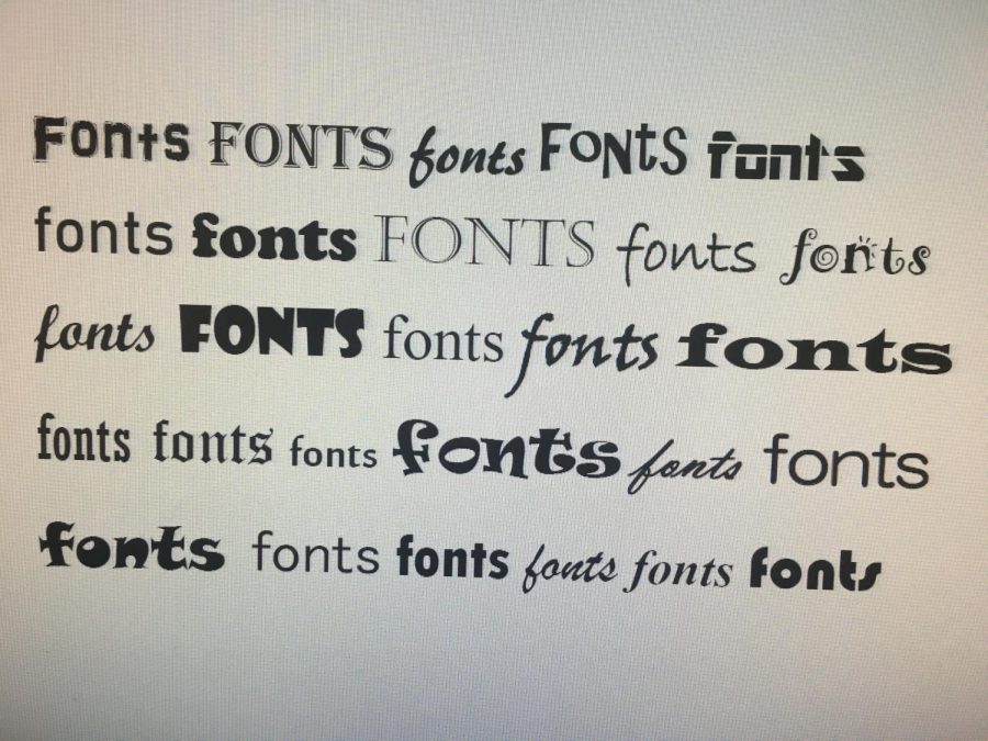
Need a cool font for a PowerPoint? Can’t decide on a font for your mom’s birthday card? Just want to know more about the word art all around you? Look no further, dear reader, for I have created this font review just for you!
![]()
Let’s start with a pretty basic font: Times New Roman. Times New Roman is a classic, but it is also incredibly boring. You see it almost everywhere, from school papers to billboards, and I’m just tired of it. However, Elise Woodfolk, font connoisseur, has a differing opinion. “I think Times New Roman is very classy,” she said. “Times New Roman is the standard for every font.” Despite expert opinion, I’m going to have to rate Times New Roman a 5/10, unless you’re using it for a formal assignment of course.
Next, let’s discuss Shadows into Light, a newcomer on the font scene. I really appreciate the thin lines; it gives off a casual, yet sophisticated, vibe. In my opinion, it’s unique and cool, but Elise doesn’t quite agree with me. “I feel like it’s something I’d see on a children’s novel. It is so not classy. I can’t. I just…I reject it,” Woodfolk said as she turned away in disgust. Personally, however, I give Shadows into Light a 7/10 because of its lack of versatility. I think it could best be used for informal PowerPoints or just for fun.
Now we move on to Orbitron. Boy oh boy, Orbitron. This font is hideous. I can’t see anyone using this unless their flying the Millenium Falcon. As usual, though, Woodfolk’s opinion varied from mine radically. On Orbitron, Woodfolk said, “It makes me think tech stuff, so it serves its purpose.” I rate Orbitron a 2/10. I am absolutely revolted. Unless you’re planning to travel the galaxy, you have no use for Orbitron.

Our penultimate font is Sacramento. I can say that this font right here is my favorite. Its delicate curves scream “lady writing a letter to her lover, circa 1879”, which I live for. Cursive fonts are not implemented often, so it could make anything you type stand out from the crowd. “It’s pretty. It’s like what I wish my handwriting would be,” said a smiling Woodfolk. I rate Sacramento a 9.5/10 and it’s perfect for any presentation, letter, or other project.
Finally, we have Gochi Hand, which I hold as the worst font on this list. It seems as though a graphic designer got tired and just let their four year old design a font for him. It really gives me expo marker vibes as well. “Why is it so thick?” asked Woodfolk, confounded by its expo marker flare. I think it’s safe to say that Gochi Hand gets a 0/10. Sorry, Gochi, whoever you are, but this font is way drab.
Whether you follow my opinion, Elise Woodfolk’s, or your own opinion, I hope that your quest to find the perfect font ends well. “Fonts are used to express what your story is about. You can get an idea about what it is about just from the font.”